
BRAND IDENTITY SYSTEM
Deliverables:
Visual Identity System
Dynamic System
Environmental Graphics & Wayfinding
Advertising & Exhibition Posters
Branded Merchandise
Staff Uniforms & Event Materials
Print Collateral
OVERVIEW
MoMI brings the world behind film, TV, and games to life. We created an identity that moves with its exhibitions, screenings, and programs.
OBJECTIVE
Refresh MoMI’s identity to reflect its creative and educational mission, bringing film, television, and digital media into a bold visual language.
PROBLEM
MoMI brings film, exhibitions, and education together, but each experience needs its own personality while still feeling part of the same museum.
SOLUTION
We created a flexible visual system that changes across different uses while keeping MoMI recognizable.
MOTIF
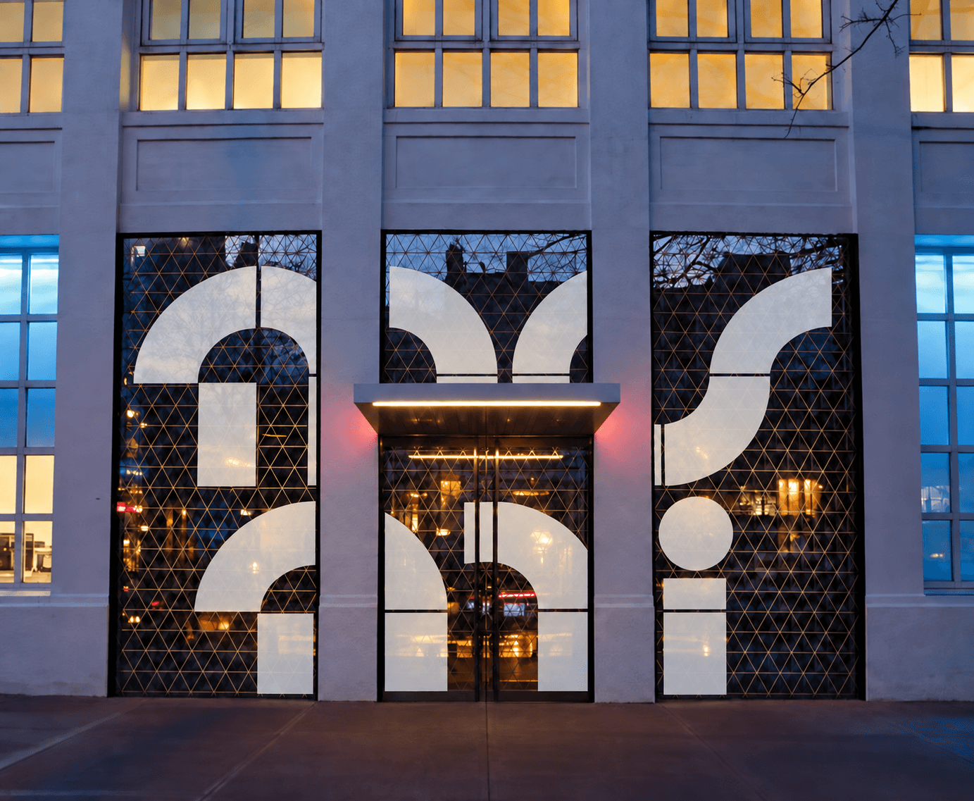
Our rebrand for MoMI is built on the idea of blocks-modular elements that symbolize both the building process of creation and the frames of film tape.


MISSION
To deepen understanding and appreciation of film, television, and digital media through exhibitions, education, and preservation.
VISION
To inspire understanding of how moving images shape the way we learn, connect, and experience the past, present, and future.
LOGO SYSTEM



COLORS
Inspired by the vivid colors of early color film and television, our palette brings a playful, nostalgic feel to MoMI.

TYPOGRAPHY
Unbounded gives headlines personality, while Plus Jakarta Sans keeps body text clear and easy to read.

ARCHETYPE

ARCHETYPE

APPLICATIONS
Billboard Poster

Exhibition Posters - Jim Henson


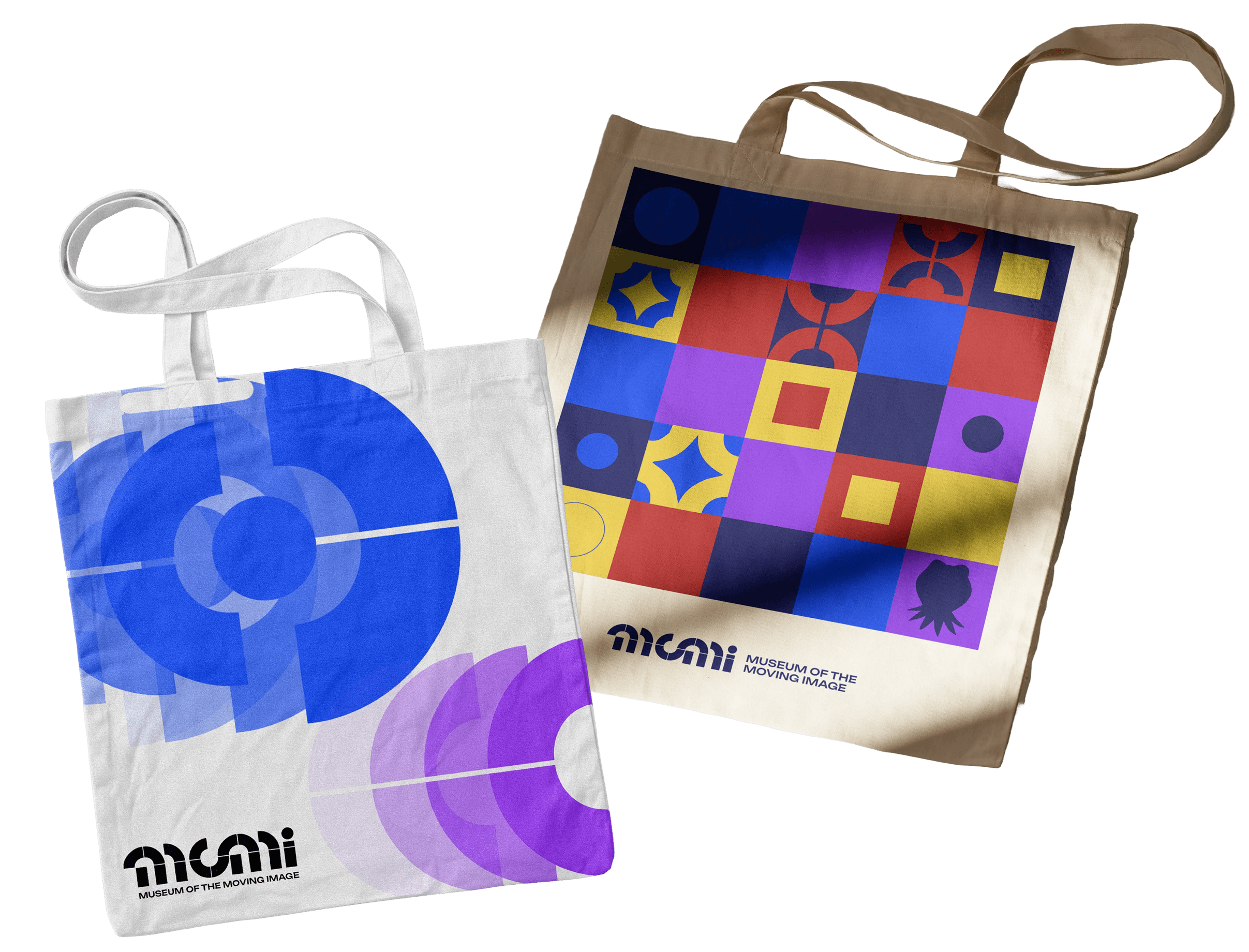
Tote Bags
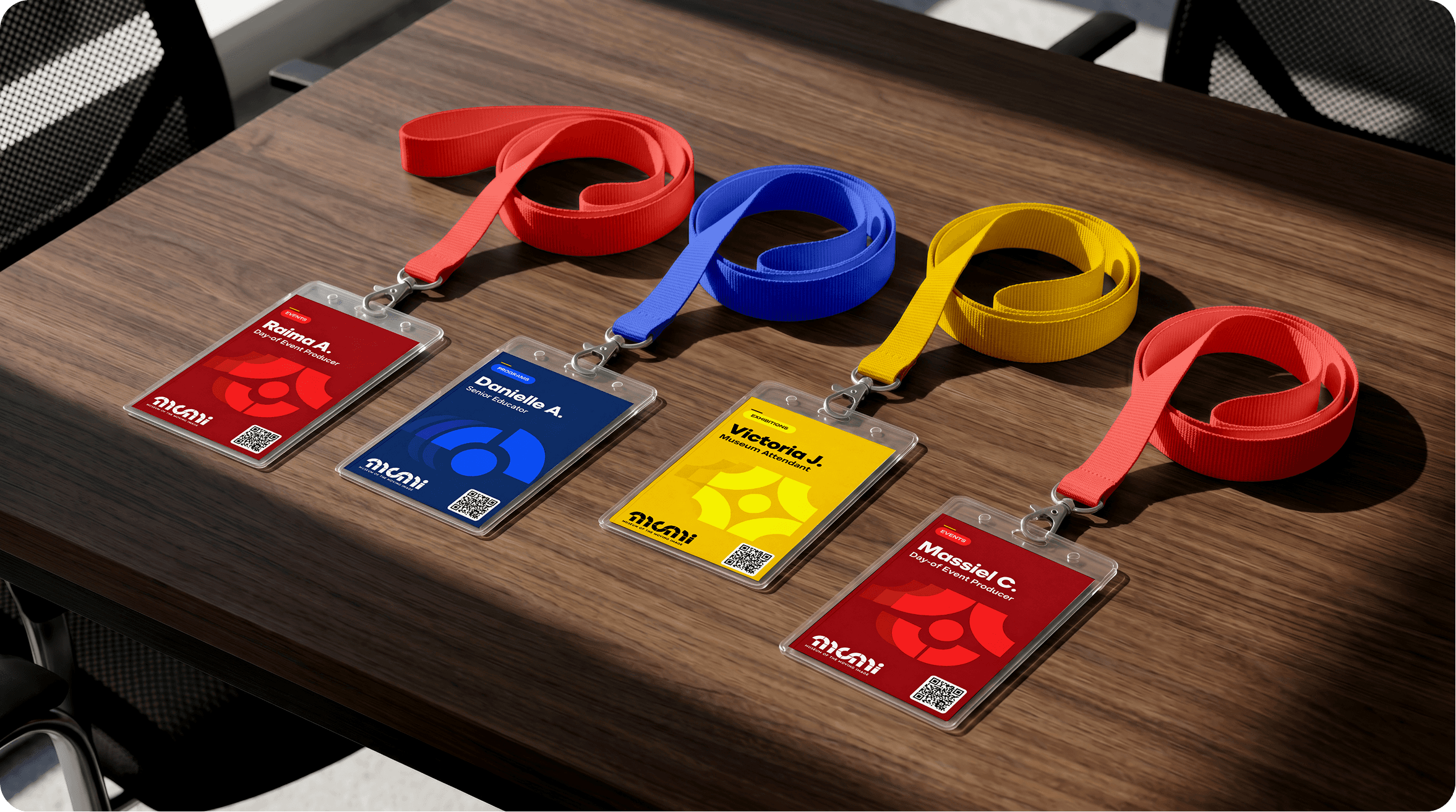
Lanyards
Enamel Pins

Staff Uniform

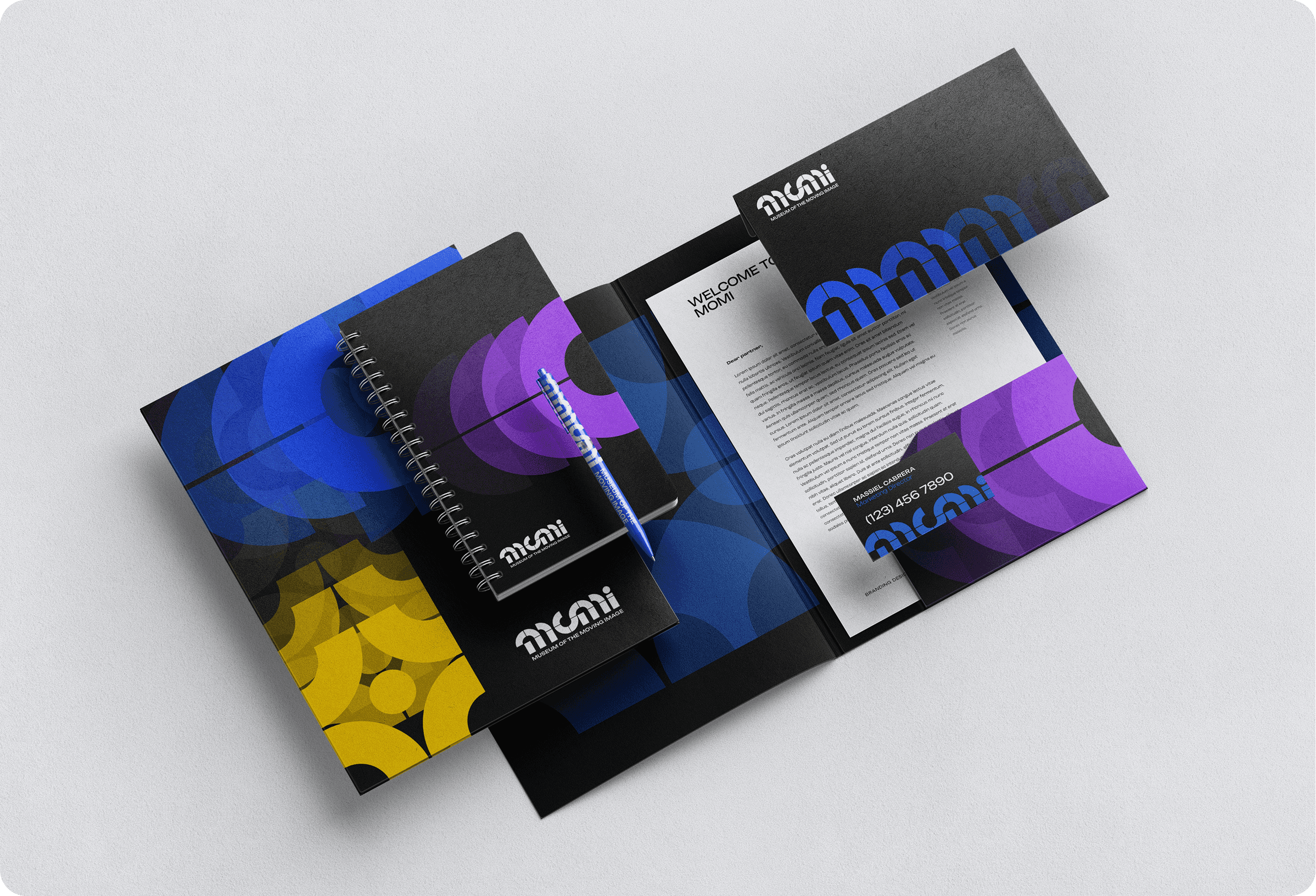
Stationery
TAKEAWAYS
This project pushed me to think beyond the logo and consider how MoMI’s identity could work across posters, merchandise, and the museum space.
I enjoyed experimenting with motion and color to reflect the moving image, while keeping the different applications consistent.
If I revisited the project, I would spend more time refining the dynamic system and testing its movement. I would also simplify some layouts so the information is easier to read.
I became more confident in my design decisions and better at using feedback to refine the identity across different applications.


